Smiling Mind UX Case Study
Index:
Introduction
Research Problems
Methodologies
System Results
SWOT Analysis
Heuristics Analysis
Persona
Top 3 Findings and Recommendations
Summary
Details of the top 3 findings and recommendations
Finding 1
Finding 2
Finding 3
Introduction:
Attending college is a significant life event for many in the United States. The tremendous lifestyle changes and mounting pressure brought by this significant event weigh heavily on students, young or old. A survey conducted by the American College Health Association (ACHA) in 2018 reveals that about 60% of respondents felt "overwhelming" anxiety, while 40% experienced depression so severe they had difficulty functioning (ACHA). University clinics struggle to keep up with the demand for help from students; many must wait for weeks before an appointment is available (US News). Mindfulness apps tabs into this demand utilizing the convenience of students’ mobile phones to provide help.
Smiling Mind is co-developed by psychologists and educators through an Australian NGO, with the goal of early mental health issue intervention of young people. This app is also available in the U.S. Android and Apple store with 500K+ downloads. In a 2015 review, Smiling Mind was rated highly in the MARS(Mobile Application Rating Scale) due to its high app content quality(Kavanagh et al., 2015), which shows its high potential amongst the U.S. college student market. With the mindfulness and meditation practice landscape ever more crowded, a reassessment is needed to gauge the usability of this app.
This report will only focus on the Android version of this app, though the learnings still apply to the Apple IOS version.
Research Problems
Can selected segments of the population use the app, Smiling Mind, to look for meditation of their choosing successfully?
What problems do this segment of users encounter when trying to use the site to execute the following function crucial to a mindfulness app?
Adding programs and/or sessions
Setting reminders
Methodologies
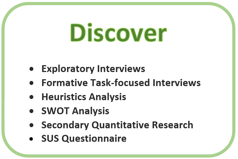
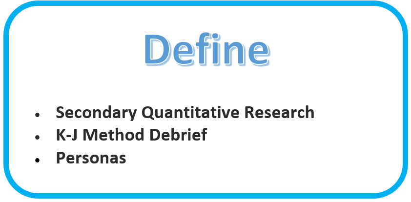
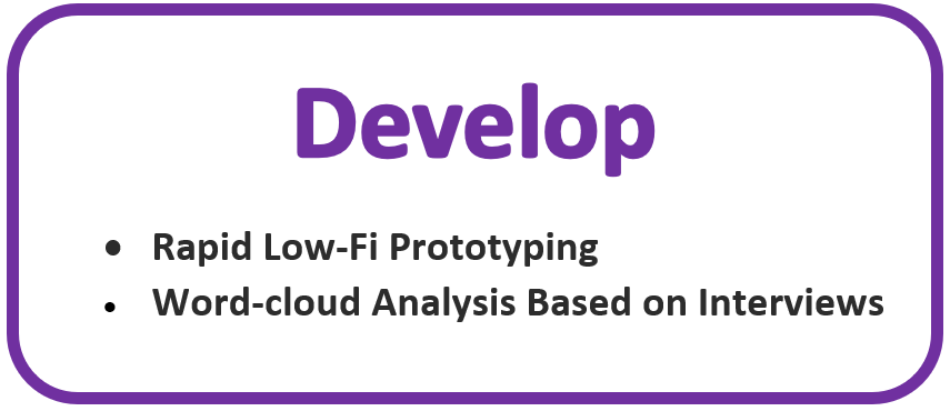
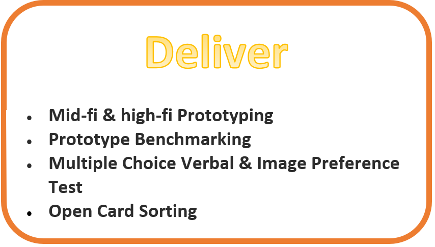
The double-diamond iterative design process was used for this case study. The below graph illustrated what research or process I conducted through each of the iterative research and design stages.
System Results
The SUS usability questionnaire(Sauro,2011) score is 41, which is below the average SUS score of 68. This reveals that the Smiling Mind app on the Android platform has some serious issue that needs to be addressed immediately.
User can find mindfulness session of their choosing, though, many system-induced mistakes occurred along the way. All 4 participants in the formative interview and task completion research had some problem looking for a specific session, adding programs and/or sessions, as well as setting reminders. Below findings will detail the problems and the recommendations.
The debrief and analysis of the research results generated 24 issues and findings, 22 Heuristics violations, and 5 areas of opportunities. Top findings and recommendations are displayed below.
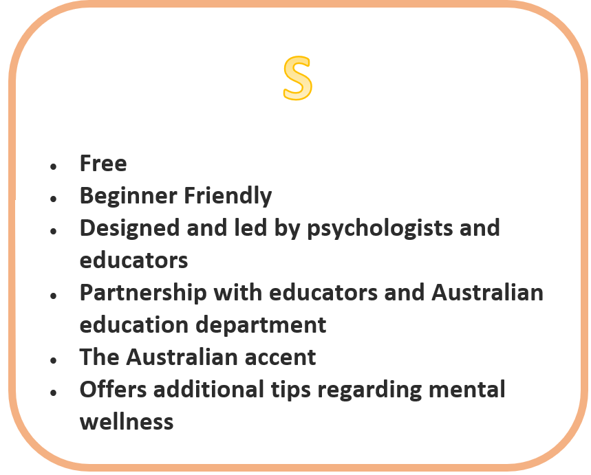
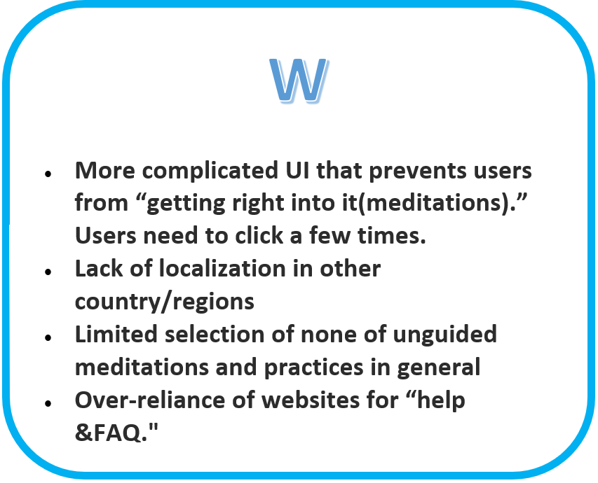
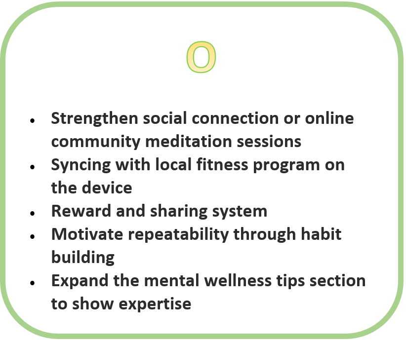
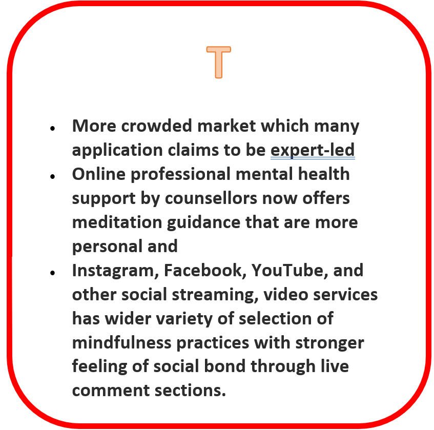
SWOT Analysis Total Findings:
A competitive SWOT analysis was conducted comparing “Smiling Mind” to discover potential areas of opportunities
Heuristics Analysis Top Findings:
A Heuristics analysis was conducted using Jakob Nielsen’s “10 Usability Heuristics for User Interface Design” to assess the usability of the app based on the best-practice principles.
Below are the unique top findings. Findings that are duplicates of the formative research results are not shown in this “top findings” section.


Persona
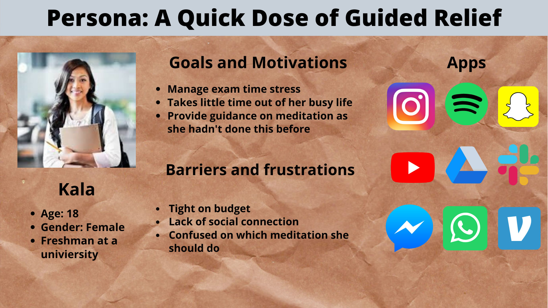
A persona was constructed using secondary quantitative, qualitative research as well as exploratory research to better formulate the problems and construct solutions.
Top 3 Findings and Recommendations:
Summary:
Finding 1: Lack of system status displays and warnings to allow users to understand the intended consequence of an action or the consequence of an applied action.
Recommendations:
Changing the “Begin Program” button to “Add to my XXX” for greater clarity and usability.
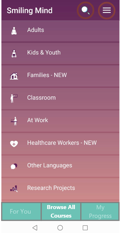
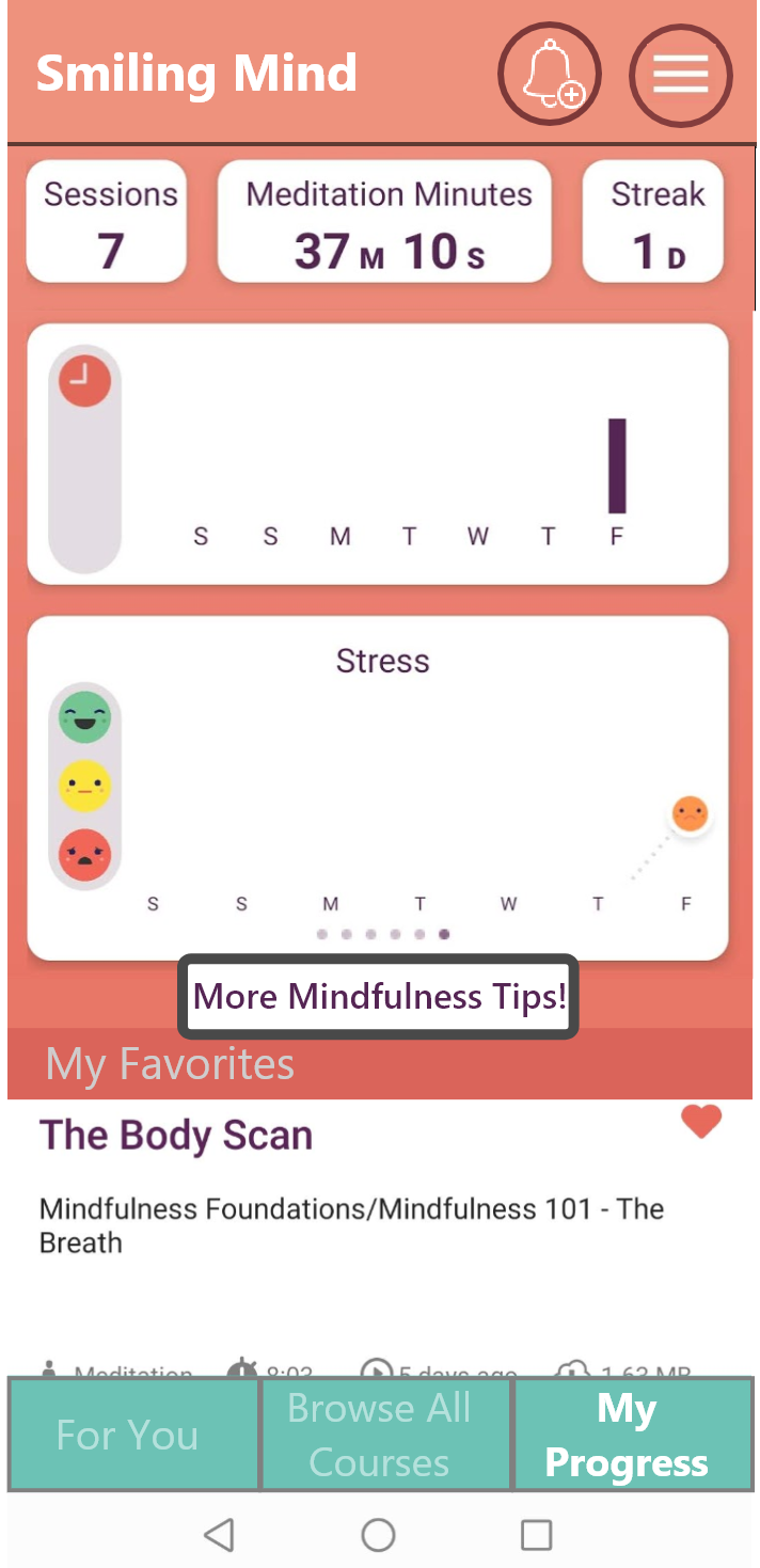
Changing Smiling Mind blog link signage from “Tips and Tricks” to “More Mindfulness Tips”
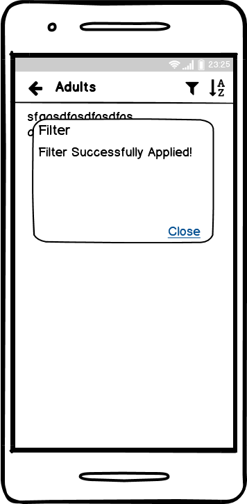
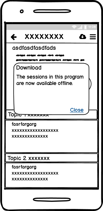
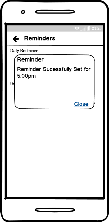
Create system pop-ups to indicate the consequence of actions. Example prototypes below for reminders and “favorites”. (examples below)
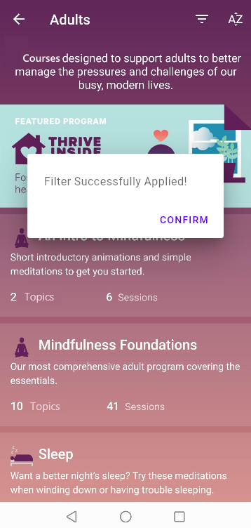
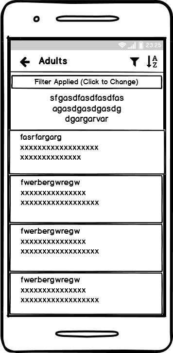
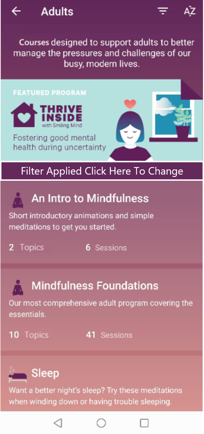
Filter application pop-up
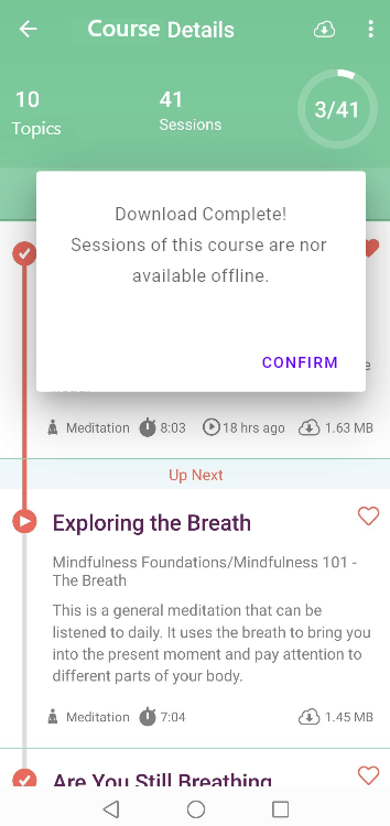
Download action pop-up
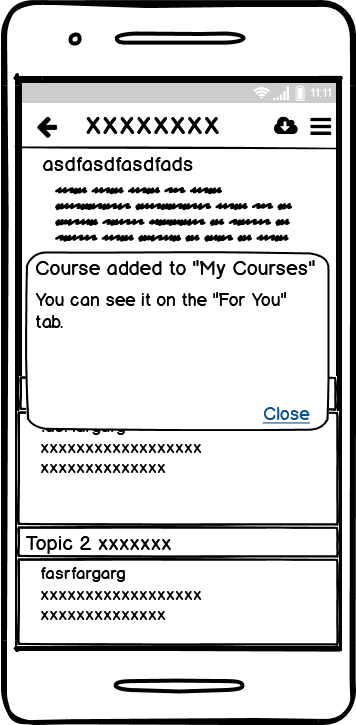
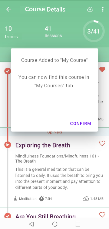
“Add to My Course”(replaces “Begin Program” button) action pop-up
Finding 2: Lack of indication of the current status of the system, such as the status of the reminders or filters.
Recommendations:
Adding established color schemes to the on/off switches(i.e. green for on).
Adopting the prototypes below to add system status indications for filters and reminders. (Examples below)
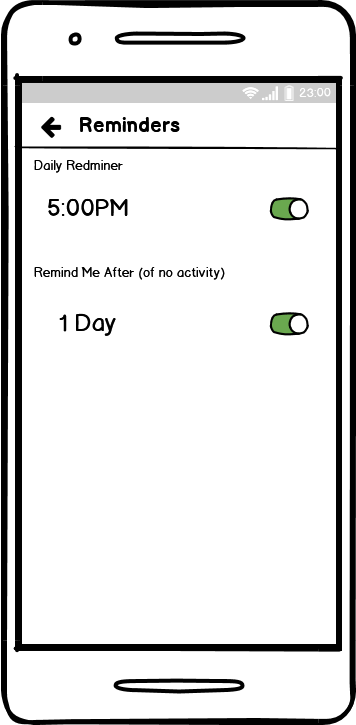
Reminder on/off button with new colors for better indications
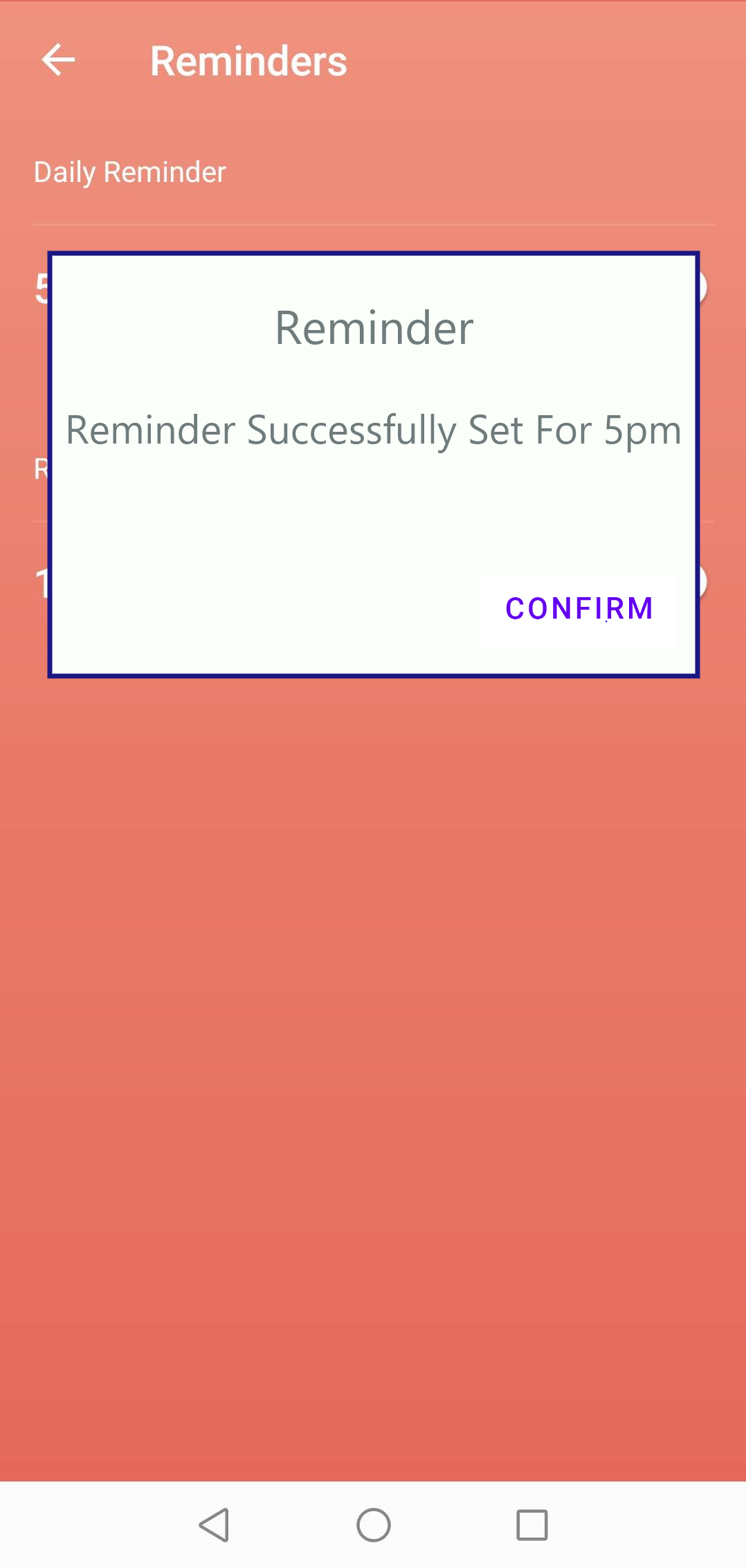
Reminder pop-up to show the status of the reminder.
Filter status display
Finding 3: The IA structure does not follow the usual information organisation of the real world. It was confusing and non-user friendly for our U.S. students. This system language and set up is too targeted towards the Australian educational purposes despite being available worldwide with 500K+ downloads. The result is that the participants felt that the system was very confusing to operate, which contributed to the low SUS score (41 vs. 68 avg).
Recommendations:
Adding localization. Change the category names “Programs” and “Modules” to more U.S. user-friendlier category names “Courses” and “Topics” for the U.S. market version.
Changing the IA structure to below, especially for the U.S. or North America market.
Adopting new interface prototypes(shown below) such as the ones below which combined the research results highlighted in many of the research in this analysis, and scored the highest task success rate (100%) during its mid-fi prototype First Click testing.
New Prototypes for the Menus
New Menu and For You tab based on First Click analysis of the mid-fi prototype, as well as results from several other research explain in this analysis
New Menu and “Browse All Courses” tab based on First Click analysis of the mid-fi prototype, as well as results from several other research explain in this analysis
New Menu and “My Progress” tab based on First Click analysis of the mid-fi prototype, as well as results from several other research explain in this analysis
Details of The Top 3 Findings:
Finding 1: Lack of system status displays and warnings to allow users to the availability and the consequence of an applied action.
Severity: 4
Location: Reminder page, sessions page when user click “heart,” filter, “begin program” buttons on “Program Details” Page
Detailed Description: Overall, the system does not have any warning or pop-up of any kind to notify the users of the consequence of an action leaving users confused about what they should do.
The system fails to show the consequence of downloading a session and where to find these downloaded sessions.
All participants said that they either "don't understand what 'begin program means' (P1, P3) or understood it as the "app automatically playing all the sessions under a program in sequence" (P2, P4). Both interpretations deviate from the system intentions because the system signage fails to display clearly the consequence of clicking the button “Begin Program”.
Participants interpreted “Tips and Tricks” to be a link to a different action than intended.
“I don’t know where the downloads went.”
“I don’t understand what ‘begin program’ means. Is it that the app automatically playing all the sessions under a program in sequence?”
“Clicking on this(Tips and Tricks) should give me some tips on how to use the app.”
Recommendations
Changing the “Begin Program” button to “Add to my programs/courses” for greater clarity and usability
Changing Smiling Mind blog link signage from “Tips and Tricks” to “More Mindfulness Tips”
Create system pop-ups to indicate the consequence of actions. Example prototypes below for reminders and “favorites”.
Studies and Results:
Button naming multiples choices: Participants were shown the UI in which the button was located, with the actual button blanked out. Then participants were asked to choose one of the names they would prefer within the given choices.
“Add to ‘My Program’” was chosen in place of “Begin Program.” This button was subsequently changed to “Add to My Course” due to the category naming study results.
“More Mindfulness Tips” was seen more favorably by participants over “Tips and Tricks".”
Prototypes:
Mid-Fi
Filter pop-up warning mid-fi prototype
Download pop-up mid-Fi Prototype
“Add to My Courses”(replaces “begin program” button) Pop-up mid-fi prototype
High-Fi Prototypes
Filter pop-up warning high-fi prototype
Download pop-up high-Fi Prototype
“Add to My Courses”(replaces “begin program” button) Pop-up high-fi prototype
Finding 2: Lack of indication of the current status of the system, such as the status of the reminders or filters.
Severity: 4
Location: Menus, tab, “All Programs” tab, “Program Details” tab
Detailed Description:
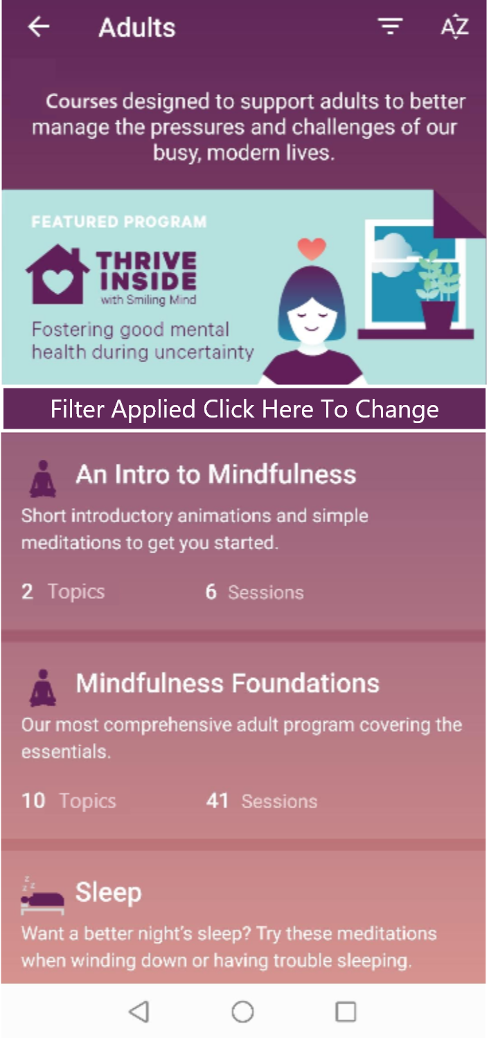
Participants weren't sure if the filters had been applied or not. The system fails to display the status of the filter application.
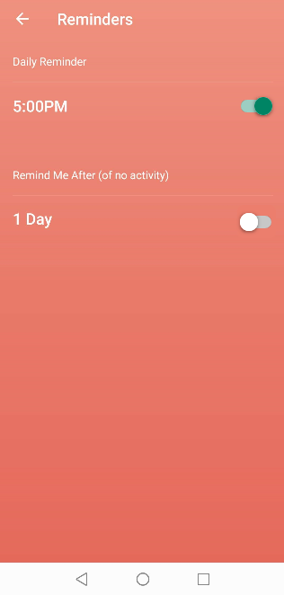
The system fails to show status of the reminder.
"The buttons are white and grey. I'm not sure which side is on and which is off" (P1, P2). The signifiers did not use effective signage to show the status of the reminders.
“I am not sure what filter is on right now.”
“I think I have the reminders set. I not super sure though.”
“The buttons are white and grey. I’m not sure which side is on and which is off.”
Recommendations
Adding verbal cues “on” and “off” or change the coloring(green for on) to the on/off switch of the reminders.
Adopting the prototypes below to add system status indications for filters and reminders.
Prototypes:
Mid-Fi prototypes
High-Fi prototypes
Reminder on/off button with new colors for better indications
Reminder pop-up to show the status of the reminder.
Filter status display
Finding 3: The IA structure does not follow the usual information organization of the real world. It was confusing and non-user friendly for our US students. This system language and set up is too targeted towards the Australian educational purposes despite being available worldwide with 500K+ downloads. The result is that the participants felt that the system was very confusing to operate, which contributed to the low SUS score (41 vs. 68 avg).
Severity: 4
Location: “All Programs” tab, “Program Details” tab
Detailed Description:
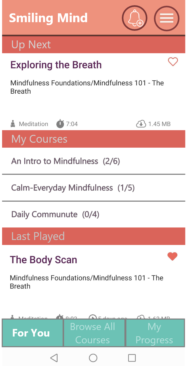
Education specific language is used throughout the app, such as "programs" and "modules." All participants noted that this language is very "confusing," which is also negatively impacting the IA structure of the app. All participants failed in at least one task due to "not understanding" the language.
IA structure for the program categorization needs improvement as it is not intuitive or helpful for the participants.
“This is confusing. I didn’t understand that modules are not programs so I didn’t click at all!”
“I thought the reminder should be somewhere on the dashboard?”
Recommendations
Adding localization. Change the category names “Programs” and “Modules” to more U.S. user-friendlier category names “Courses” and “Topics” for the U.S. market version.
Changing the IA structure to below, especially for the U.S. or North America market.
Adopting new interface prototypes(shown below) such as the ones below which combined the research results highlighted in many of the research in this analysis, and scored the highest task success rate (100%) during its mid-fi prototype First Click testing.
Studies, Prototypes, and Results:
Category naming multiples choices: Participants were given the scenarios and were asked to name the two levels of categories using one of five options for each category.
“Courses” and “Topics” was individually chosen more frequently and chosen as a pair more often than other category names.
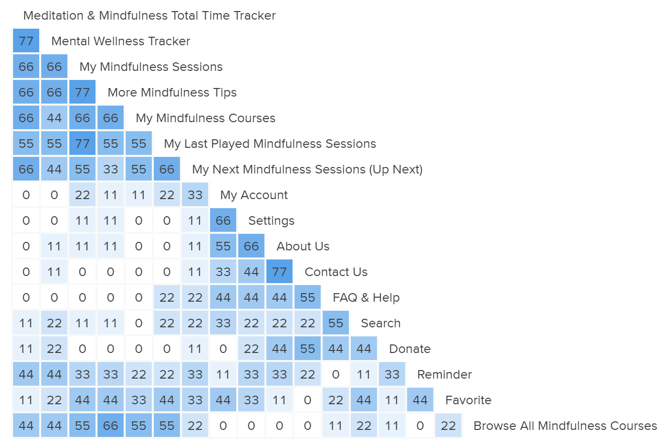
Open card sorting Similarity Matrix results:
Open Card Sorting Matrix Analysis
Open Card Sorting Similarity Matrix Analysis Reveals that
“More Mindfulness Tips” should be found in both the “Browse All Mindfulness Courses” and “My Mindfulness Sessions” tab.
“My Mindfulness Courses,” “My Last Played Mindfulness Sessions,” and “My Next Mindfulness Sessions” should be categorized as one.
“Meditation & Mindfulness Total Time Tracker,” “Mental Wellness Tracker,” “My Mindfulness Sessions”, and “More Mindfulness Tips” should be categorized as one.
Due to the possible duplicate nature of “My Mindfulness Sessions” and “My Mindfulness Courses,” the content of the two categories need to have enough difference.
“Favorite” can be group with several different options. Though it is recommended to be grouped with “Meditation & Mindfulness Total Time Tracker,” “Mental Wellness Tracker,” “My Mindfulness Sessions” due to reduce the amount of scrolling user needs to do to get to “favorite.”
Reminder and Browse All Courses should have their own options.
First-Click Benchmarking Analysis Results for Mid-fi Prototypes:
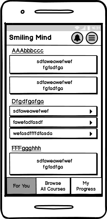
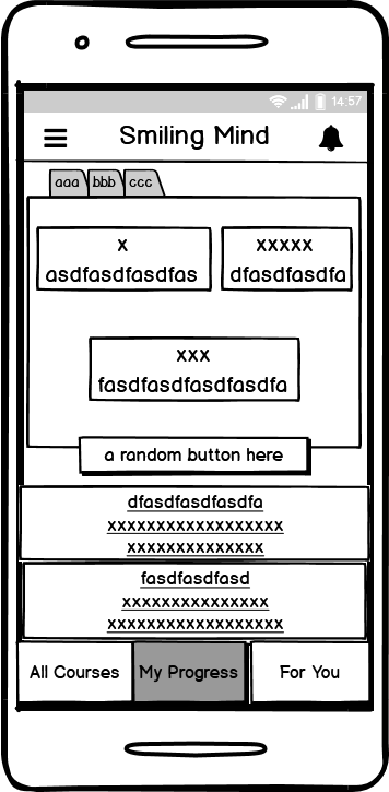
A First Click test was administered to test and compare the usability of the below 2 test mid-fi Prototypes and control mid-fi mock-up. 9 Participants were shown only one of the below images, which the participants will use that prototype to complete 3 tasks. Task Success rate was recorded for each of the tasks.
Mid-fi Prototype 1
Mid-fi Prototype 2
Control Mid-fi Mock-up
Prototype 1 had the highest task success rate amongst the three at 100%.
