God of War UX Heuristics Review and Formative Playthrough Analysis
God of War, without a doubt, was one of the most wonderfully executed games on PS4. Being one of the only games that I have played three times through, God of War is definitely worthy of a UX analysis. As Jakob Nielsen has said in his review of the gaming UX discipline, the 10 Heuristics still applies in gaming(Nielsen, 2016). Even though the end goals differ between gaming and utility applications, functionalities vs. fun, the base principles still apply. Thus, I will put the God of War PS4 game in for a review.
Let’s crack on!
Index:
Formative Playthrough Analysis Findings and Emotional Journeys: Ineffective Loading Screen of God of War
Recommendation
Top 4 Heuristics Review Findings and Recommendations
Recommendation Summary
Finding 1
Recommendation to Finding 1
Finding 2
Recommendation to Finding 2
Finding 3
Recommendation to Finding 3
Finding 4
Recommendation to Finding 4
Formative Playthrough Analysis Findings and Emotional Journeys: Ineffective Loading Screen of God of War
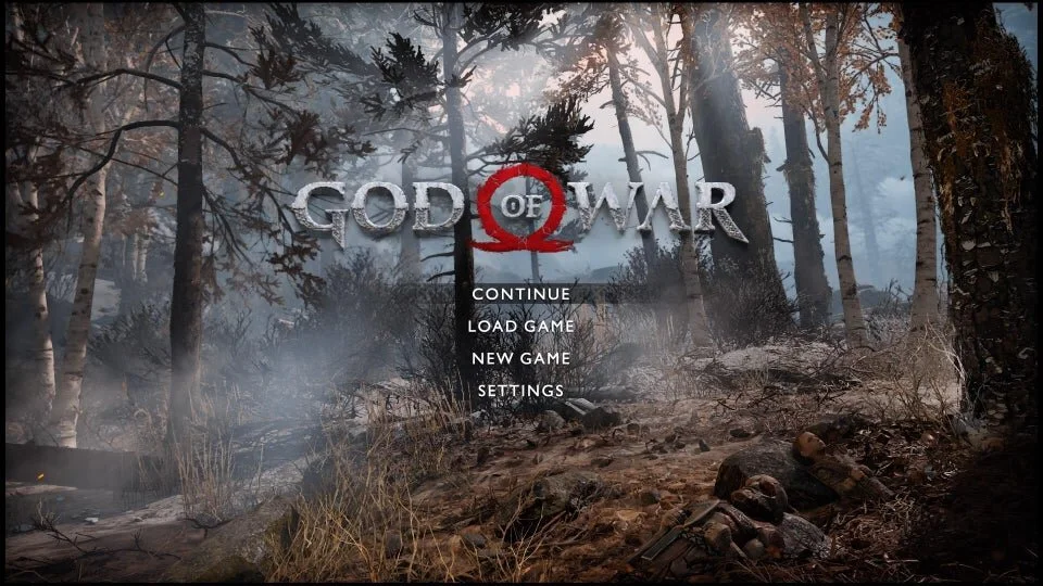
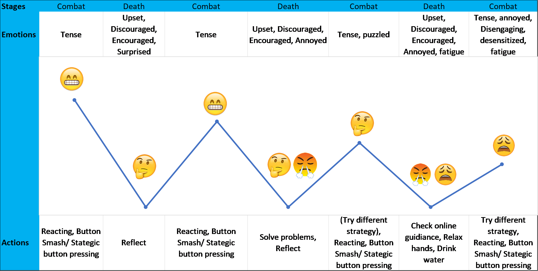
God of War errs on the side of minimal reading instructions in the game. It utilizes the secondary characters: Atreus and Mimir’s conversations to help guide players where needed. All repeating tips and instructions are generally found on the loading screen between deaths and loading the game when first opening. Thus, the more deaths Kratos has, the more the players can potentially learn. However, that is not precisely the case. During the playthroughs, many deaths repeatedly occurred at the same spot, meaning the players are running into cruxes where more skills, learning, or attention are required from the players.
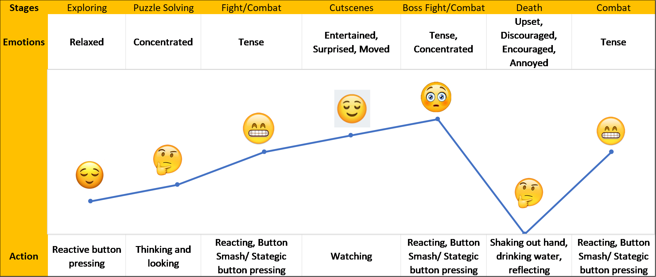
Two problems occur here. First, players are filled with actions and emotions that makes reading from the TV screen an ineffective way to learn. Second, players start to disengage due to desensitization and fatigue. Below compares the emotional journey of a player to the emotional journey of a player during crux encounters.
Player Emotions Journey Through GOW
Player Emotions Journey During Crux Encounters
Additionally, deaths are major interruptions to these hack-and-slash genre games where experience is more fluid with varied pacings and intensities. The loading screen should reflect slower pacing, but not an almost full-stop to their gaming experiences. This stoppage of flow contracts too widely with the intense experience during combat, which contributes to disengagement of the players.
Recommendations:
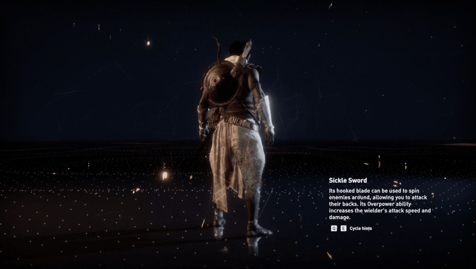
Allowing players to practice game combo while displaying tips could be an excellent way to keep players engaged during the loading screen. The new practice loading scene goes well with the reflection and problem-solving behaviors that players engage in during the loading scenes. See Assassin’s Creed Origins loading screen below as an example. This loading scene also helps players to discover more of the rich combat mechanics that God of War offers, thus, keeping the players more engaged with the game.
Top 4 Heuristics Review Findings and Recommendations:
Recommendation Summary:
Technically reduce the visual lag of the primary signifier, the fading of the red screen.
Adding more identifiable audio feedback to increase the noticeability of exiting the rage mode.
Adding indication to depletion of the rage gauge(such as flashing of the rage gauge), to better signify the upcoming exit of the rage mode.
Provide a line of an explanation similar to the stats descriptions below. The key is for the player to understand the trade-offs of having a higher or lower value of this level.
Change the stats display from points to values such as percentages, damage value, percentage reduction so that players can easily understand the difference when using different pieces of gear. We want the players to focus more on trying different play styles using different pieces of gear, not spending time trying but failing to understand gear stats.
Switching the dotted lines with dotted arrow lines to help players better understand the map.
Finding 1: Players are not clear whether they have successfully executed the exit of rage mode.
Location: Combat
Heuristics Violated: #1 Visibility of system status
Description: Lack of visual indications during rage mode and lack of visual, haptic feedback of exiting rage mode. This is especially problematic during intense fights where players are more likely to use rage mode to drastically increase survivability. This is caused by two problems. First, the visual indication is not where the players are constantly looking at through the fight. Second, the key visual signifier has an around 1.5 second lag.
The most prominent signifier of player exiting the rage mode- the red full screen glow- has an around 1.5 second lag.
Makes matters worse, players’ attention is likely not focused on the secondary signifiers, the drawing of weapons during an intense encounter. The depletion of the rage gauge is also a secondary signifier. However, this signifier performed poorly during the three playthroughs as it was off on timing by a big margin when indicating the exit of rage mode.
Recommendations to Finding 1:
Technically reduce the visual lag of the primary signifier, the fading of the red screen.
Adding more identifiable audio feedback to increase the noticeability of exiting the rage mode
Adding indication to depletion of the rage gauge(such as flashing of the rage gauge), to better signify the upcoming exit of the rage mode.
Finding 2: The impact of “level” is not clear to players
Location: Gear and Map Menu
Heuristics Violated: #10: Help and documentation
Description: Missing explanations on the "levels." The gear level is confusing and feels irrelevant to the game. There is no explanation of how it relates to part of the game
Recommendation to Finding 2:
Provide a line of an explanation similar to the stats descriptions below. The key is for the player to understand the trade-offs of having a higher or lower value of this level.
Findings 3: Lack of indication of the impact of the numerical values of character stats changes cause player confusion.
Location: Gear and Map Menu
Heuristics Violated: #1: Visibility of system status, #2: Match between system and the real world
Description: Only the meaning of the stats are provided for the character, the actual numerical meaning, impact of the value of the stats are not well explained. This drastically steepens the learning curve for the players as they often have to spend extra time, effort to find out if their gear works for them or not, rather than trying the gear on to play. The consequence is that it confuses the players and increases player frustration unnecessarily, especially at difficulties greater than normal levels.
Recommendations to Finding 3:
Change the stats display from points to values such as percentages, damage value, percentage reduction so that players can easily understand the difference when using different pieces of gear. We want the players to focus more on trying different play styles using different pieces of gear, not spending time trying but failing to understand gear stats.
Findings 4: Ambiguous signifiers as direction guide for quests on map.
Location: Gear and Map Menu
Heuristics Violated: #1: Visibility of system status, #2: Match between system and the real world
Description: The game utilizes the in-game compass to guide players to a quest without leaving the game screen. However, most players have learned the behavior of map-reading in games that allows for explorations. The map in GOW does not do a good job of indicating clearly the location and path to a quest. Some quests do have dotted lines to guide them towards the quest. However, these dotted lines are not intuitive to users are direction guidance signifiers.
Recommendation to Finding 4:
o Switching the dotted lines with dotted arrow lines to help players better understand the map.
