Expedia Flight and Flight Bundle User Experience Review
Research Problems
Can selected segments of the population use the site, Expedia.com, to plan their flights or flight bundles successfully?
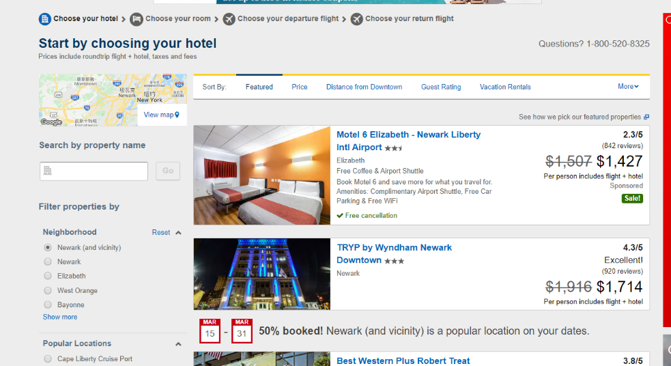
What problems do this segment of users encounter when trying to use the site to plan their flights or flight bundles?
Methodologies
Population: The target population for this research is consumers who are established in their lives(age 35 to 80, middle to upper class in the US)who go on vacation with more than just themselves for at least once per year.
Recruiting and sample: The recruiting strategy used in this research is the snowball sampling and panellist recruiting. This method was chosen due to the sample availability and cost. The demographic information was collected as part of the pre-test interview questions. Panellists were drawn from Amazon mTurk service age 35-80 who are located in the U.S. with household annual income of $42000 and above.
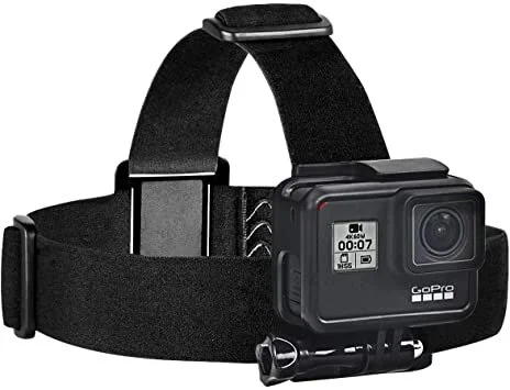
Instruments: The instruments used to collect information are: GoPro Camera, Participant’s own computer, pre-test interview, post-test questionnaire, and a list of tasks.
Tasks and surveys:
In-person Formative Interview: The participants are asked to complete a set of tasks using the website Expedia.com. A GoPro camera will be strapped to their heads to record the session in videos. A pre-test interview with 6 questions was administered before the participants start the tasks to get a sense of the demo as well as building rapport. The task portion consists of a maximum of 6 tasks (see appendix for the specific task descriptions). Immediately after the last task, a SUS questionnaire (see appendix) to access the usability of Expedia.com.
Remote Qualitative Benchmarking: The participants will complete 3 tasks using 3 websites (Expedia.com, Google Flights, Delta.com) to find out how long it takes for the users to find the “multi-city” option.
Eye-tracking using Heatmaps: 30 Participants were asked to click on all the spots they looked on the webpage they were exposed to help track their eyesight.
Competitive Benchmarking: 4 Participants were asked to complete similar task on 3 different websites: Expedia.com, Google Flights, and Delta.com.
Prototype Benchmarking using Timed Heatmaps: 69 Participants were randomly grouped into 2 groups. The 2 groups were exposed to different sets of tasks, prototypes, and the control to reduce the priming bias. Participants were asked to click on the options they would choose for either a round-trip or a “multi-city” trip.
Information Architecture improvement using Open Card Sorting: 10 Participants were given 30 terms to sort into groups based on the participants’ own perspectives. Participants also needed to provide the groups with appropriate names.
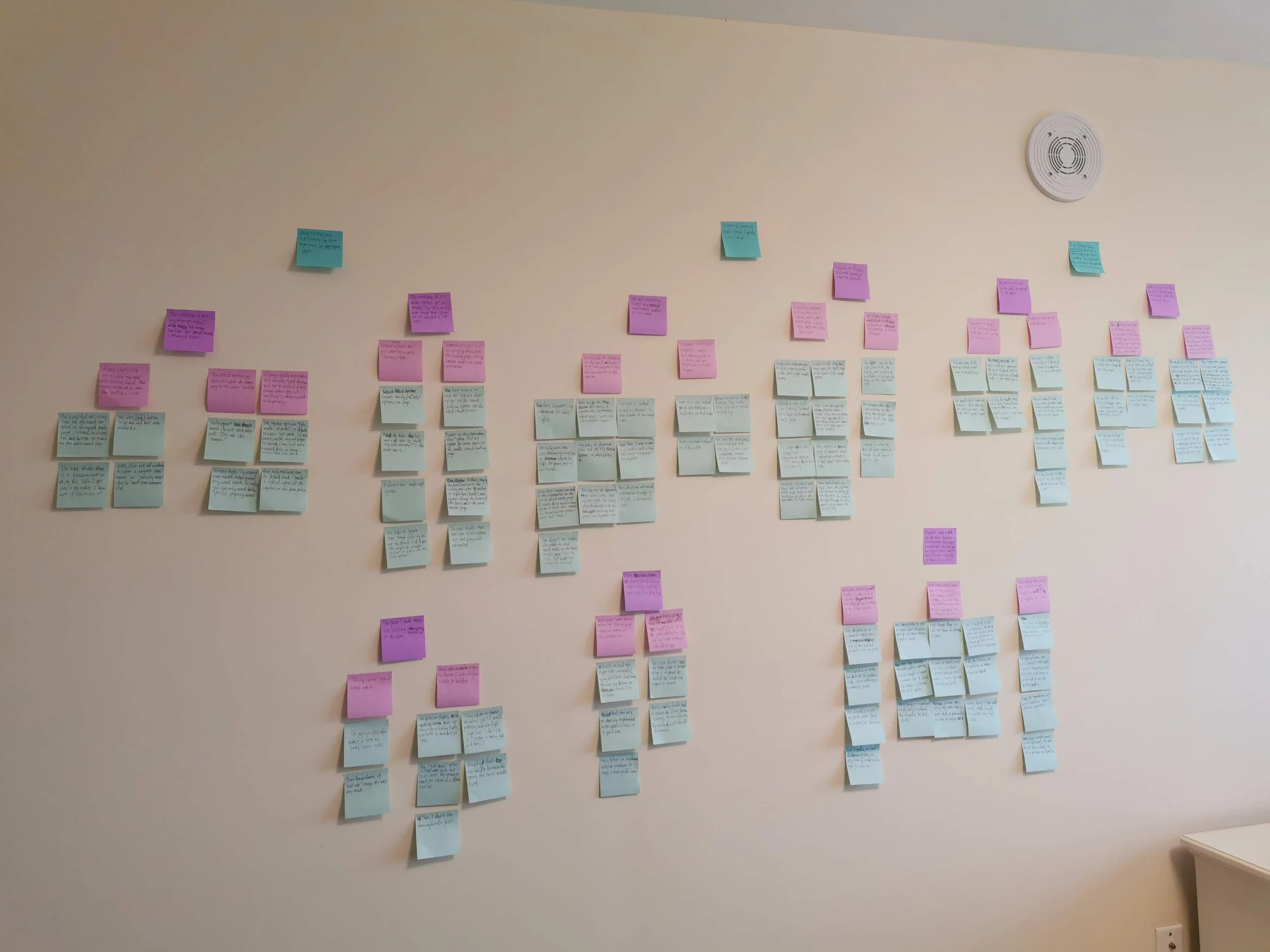
Debrief: Utilising the K-J method to collect and summarise the important findings and takeaways.
In-person interview equipement.
Click Heatmaps and ranking survey
Card Sorting survey
Competitive Benchmarking
System Results
The SUS questionnaire score is 66.5 which is below the average SUS score of 68. This reveals that the flight and flight bundle booking systems have some serious usability issues. Four out of the five participants have said that the system has too much information. One participant even said that the system “needs to get into it to use it well.”
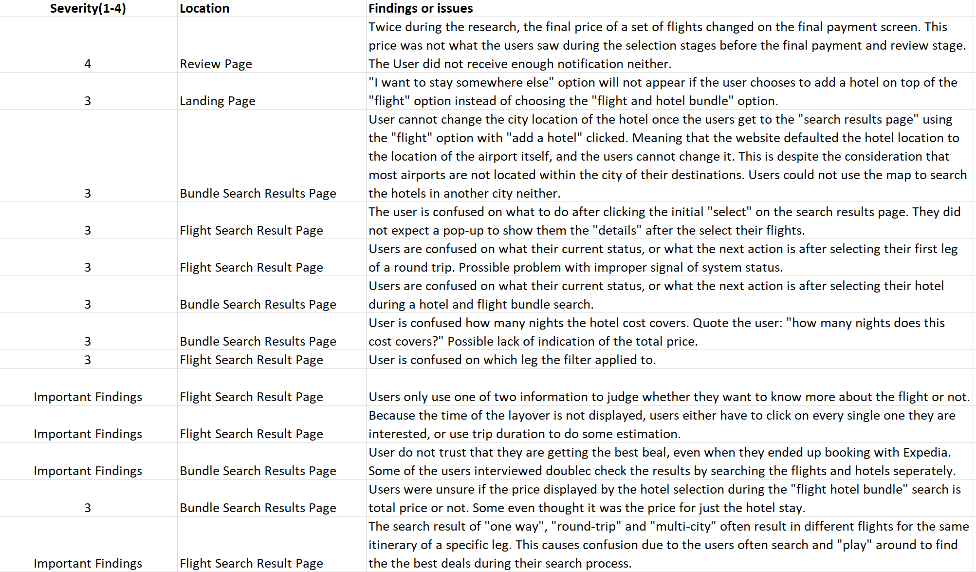
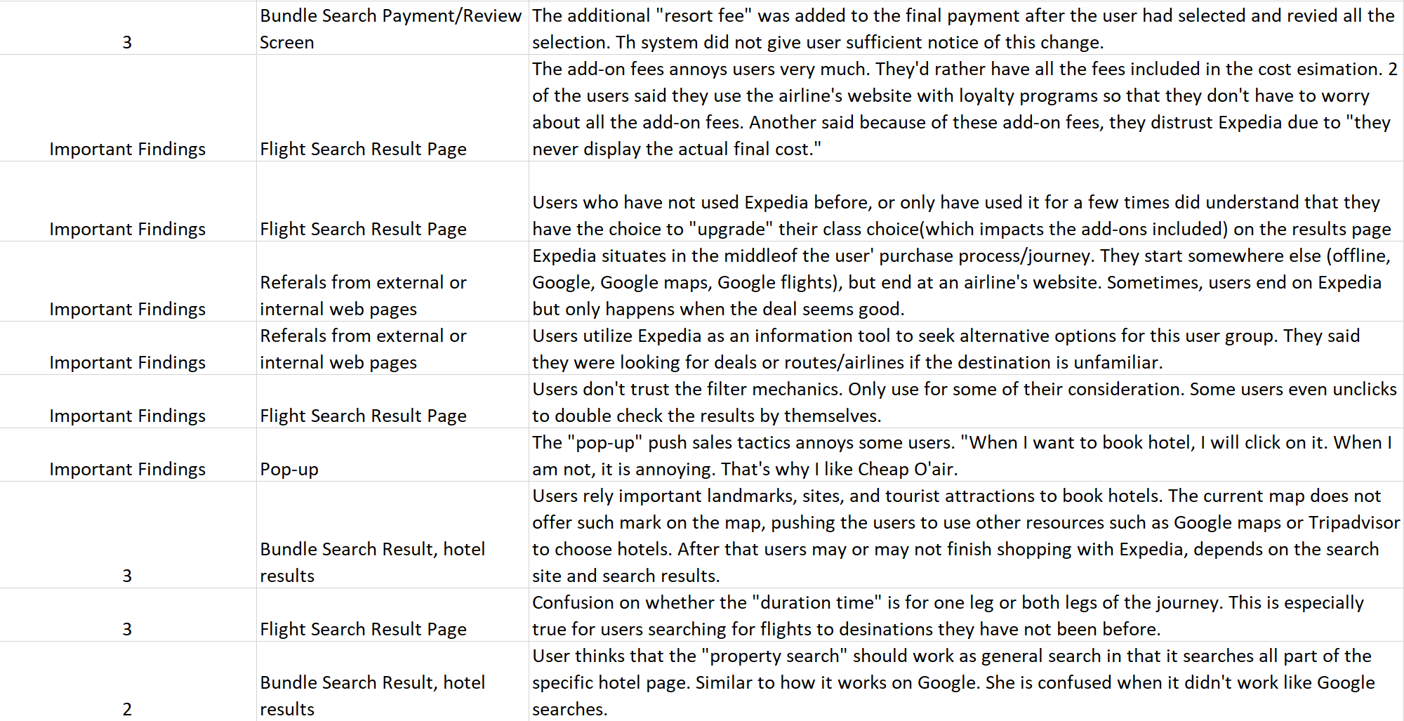
The debrief and analysis of the results generated 29 issues and findings. Below is the detailed Top 3 findings and recommendations. Please see rest of the 26 findings in the appendix section.
The affinity wall using the K-J debrief method to debrief and summarize results
Top Top 3 Findings and Recommendations:
Summary:
Finding 1: Users do not “see” or not using the “multi-city” option.
Recommendations:
Use “Multiple Destinations” as the option label and place the “Multiple Destinations” as the first of three tabs of the category (see the prototype example in the below detailed results.)
Finding 2: Users cannot find help when lost.
Recommendations:
Changing the category name to “customer service”. Card sorting research on a larger scale with more participants is needed to decide on the final name.
Changing the option name: additional research is required to decide on the new name
Adding the “help” like options to more places: users were very divided on the category name of “customer support” and “help” options. Adding more help options under different categories and places give the users more chances to get help, reducing their frustration.
Finding 3: Forcing users to choose hotels before flights during bundle search causes the users to abandon the bundle search.
Recommendations:
Change the bundle search process to selecting flights first as this follows the users' natural though progressions. More quantitative research can be conducted using a survey to assess if a statistically significant portion of the population like to book flights before hotels. Additionally, constructing a user shopping journey map will also help Expedia to design the shopping process that is more natural for the users.
Details of The Top 3 Findings:
Finding 1: Users do not “see” or not using the “multi-city” option.
Severity: 4
Location: Landing Page
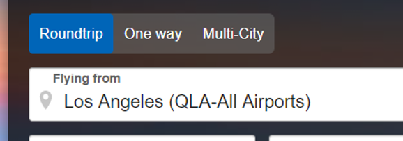
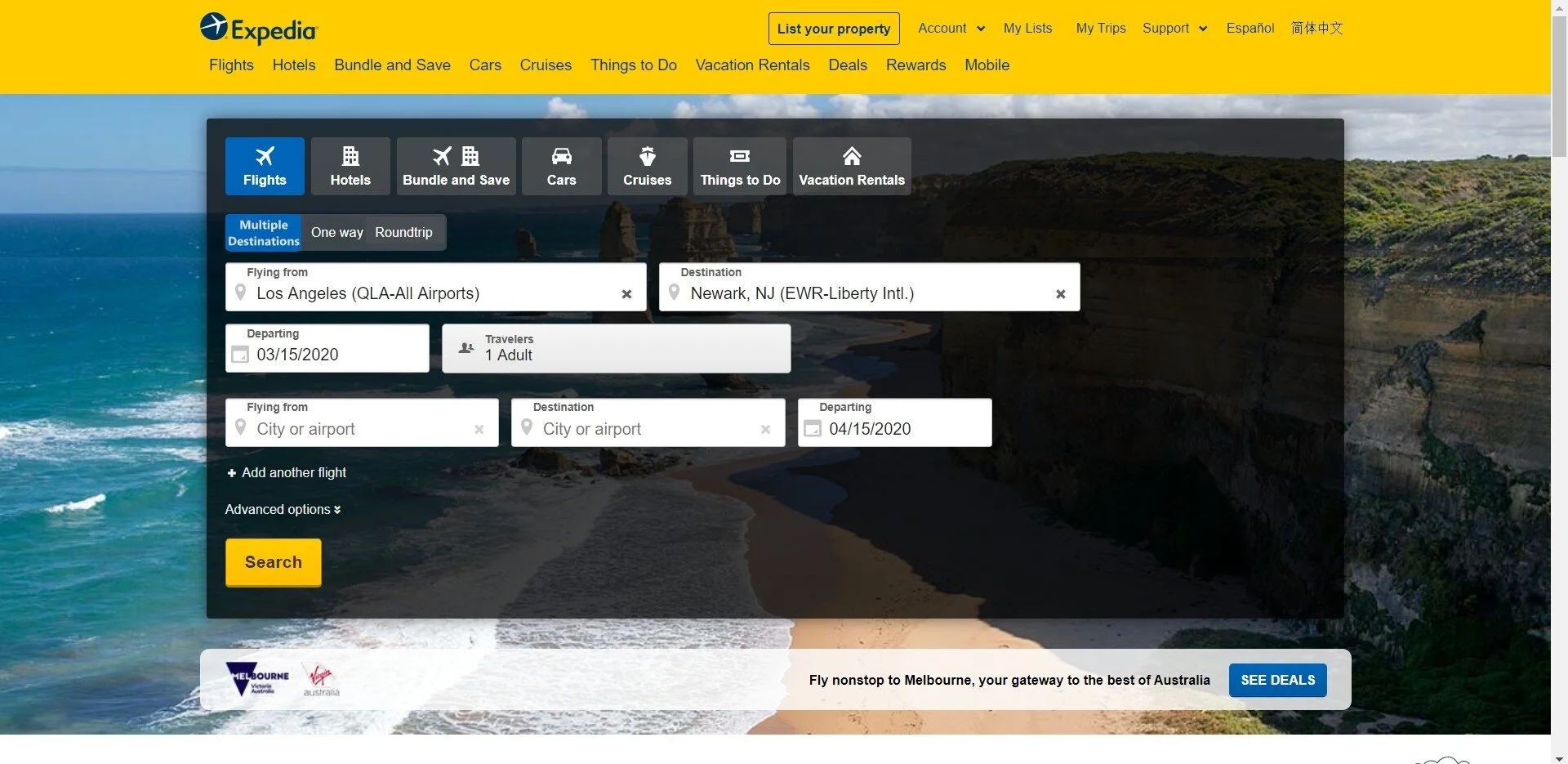
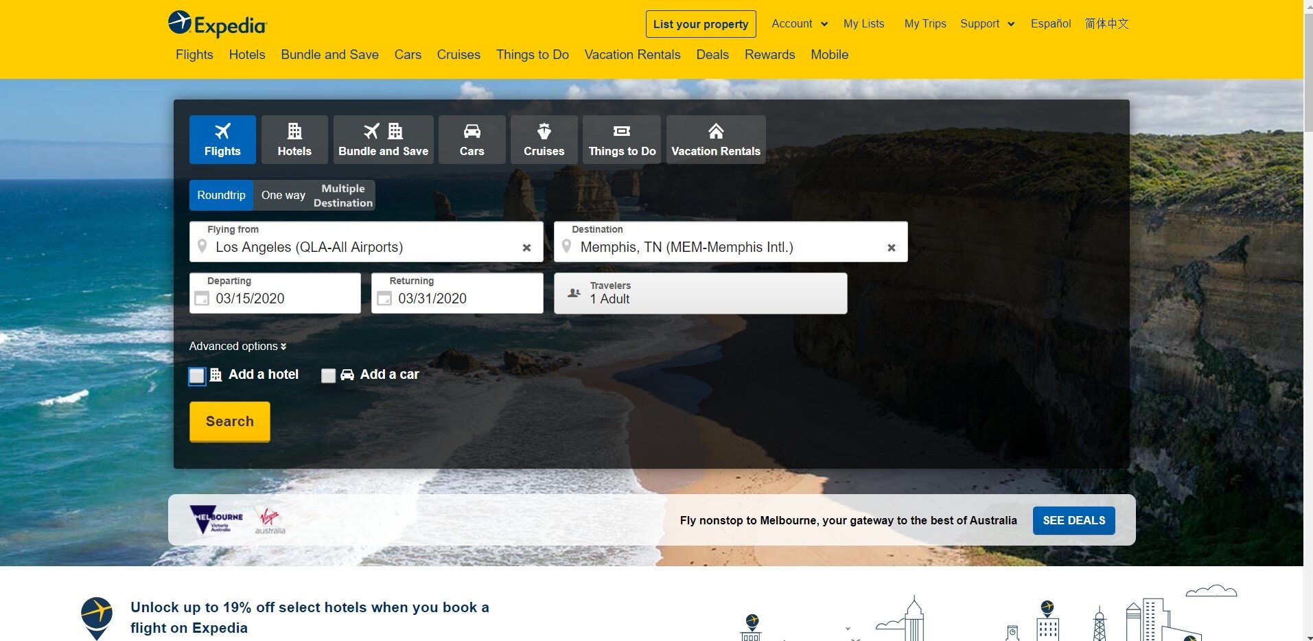
Detailed Description: Users did not see the "multi-city" option, even though it was right next to the "round trip" and "one way" options. This is problematic because affluent users are 58% more likely to book trips to multiple destinations.
Study Results and Recommendations:
Results:
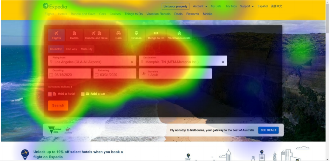
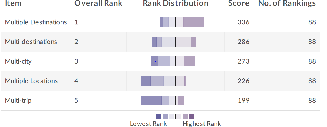
Heatmap reveals that consumers are looking at the region which contains the “multi-city” option. However, they are not understanding or interpreting the meaning of the phrase “multi-city” the same way as the designers. The name ranking study shows that “multiple destinations” is the preferred term by research participants.
Recommendations:
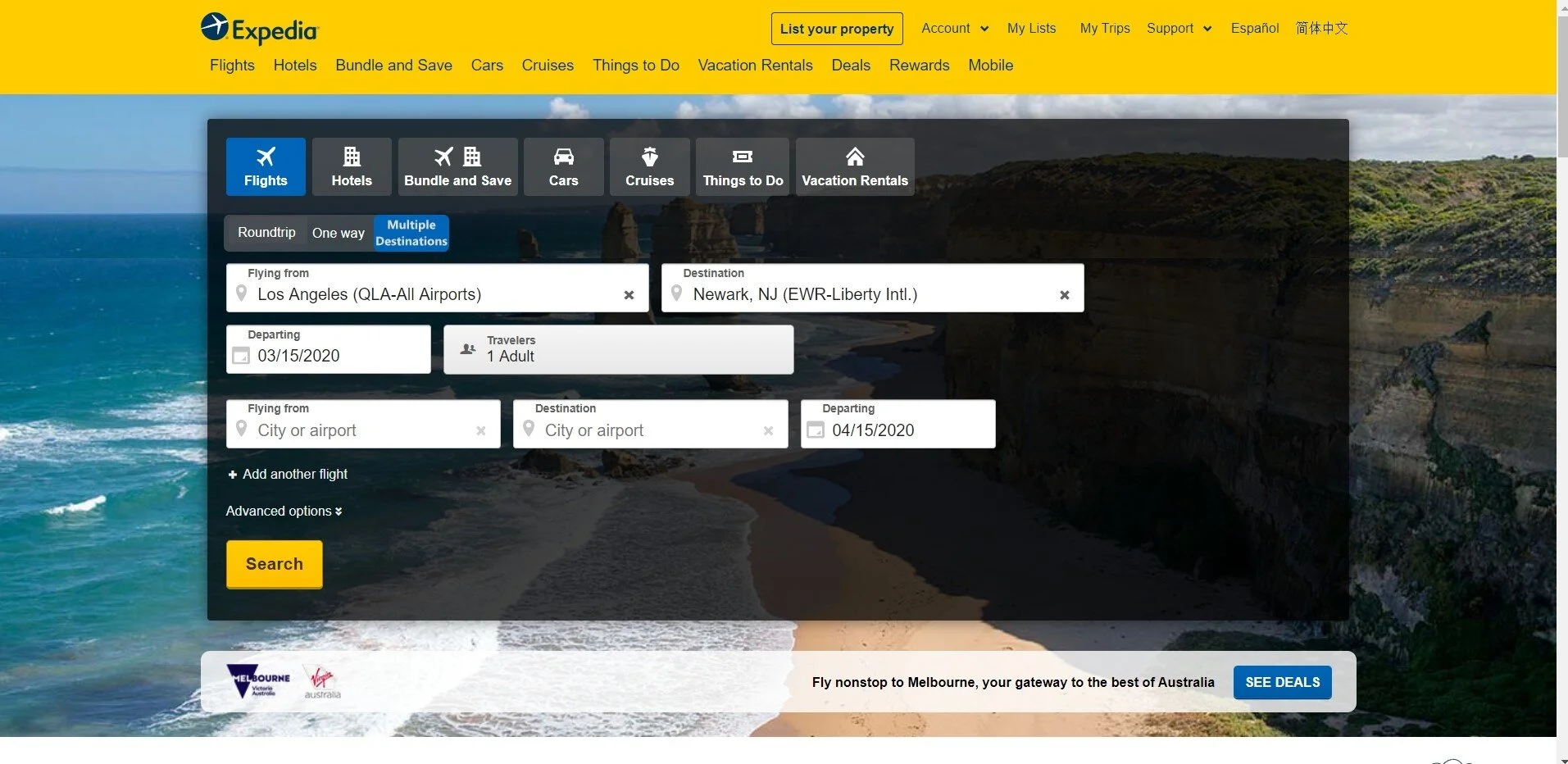
Use “Multiple Destinations” as the option label and place the “Multiple Destinations” as the first of three tabs of the category like below prototype.
Recommended Prototype
Detailed Results by Study:
Competitive Benchmarking Results:
All three websites had 75% completion rate, even when participants have clicked on the right category (in the case of Google Flights and Delta.com), suggesting that users may not be familiar or are not comprehending the “multi-city” options.
In successful attempts, participants made more errors using Expedia.com when trying to find the “multi-city” option than both attempts on Google Flights and Delta.com. These errors contributed to the higher average time-on-completed-task for Expedia.com.
Heatmap Results:
Heatmap reveals that participants were looking around the “multi-city” option button. Users not being able to find or not using the “multi-city” option is not contributed by users not seeing the option button.
Heatmap of the existing Expedia.com landing page where users can find the “multi-city” option
Option Naming Ranking Survey Results:
Based on the in-person interview, “multiple destinations,” “multi-destinations,” “multi-trip,” and “multiple locations” were ranked along with the existing “multi-city” to find out the best name for the option.
“Multiple Destinations” was the clear winner, which shows that the name of the option is most likely to be causing the users to not “see” or not use the “multi-city” option.
Prototype Benchmarking through Timed Click Heatmap Results:
Participants find it much easier to exercise the right action which is to click on the “Multiple Destinations” button in test copy 2 due to its improved wording(based on the ranking results) and its improved positioning on the webpage.
At the same time, participants can still find the “round-trip” button with relative ease in the test copy 2 compare to the control copy, despite the new positioning of the “round-trip” button.
Control copy
Test copy 1
Test copy 2
Finding 2: Users cannot find help when lost.
Location: Search Results Page
Severity: 4
Detailed Descriptions: Participants were having trouble finding help on Expedia.com when they were lost. One participant used 10 minutes to find help. Another participant gave up trying to find the “help” option all together.
Study Results and Recommendations:
Results:
Expedia users of the selected population are confused on the labelling of both the help option itself, and the category name which the help option supposed to be under. Users interprets the option “customer support” differently between each other, and differently from the designers. Although users think that it is correct that “customer support” and “feedback” should be categorized together, they have very different ideas on how this category should be named.
Recommendations:
Changing the category name to “customer service”. Card sorting research using more resources with significantly more participants is needed to decide on the final name.
Changing the option name: additional research is required to decide on the new name
Adding the “help” like options to more places: users were very divided on the category name of “customer support” and “help” options. Adding more help options under different categories and places give the users more chances to get help, reducing their frustration.
Detailed Results by Study:
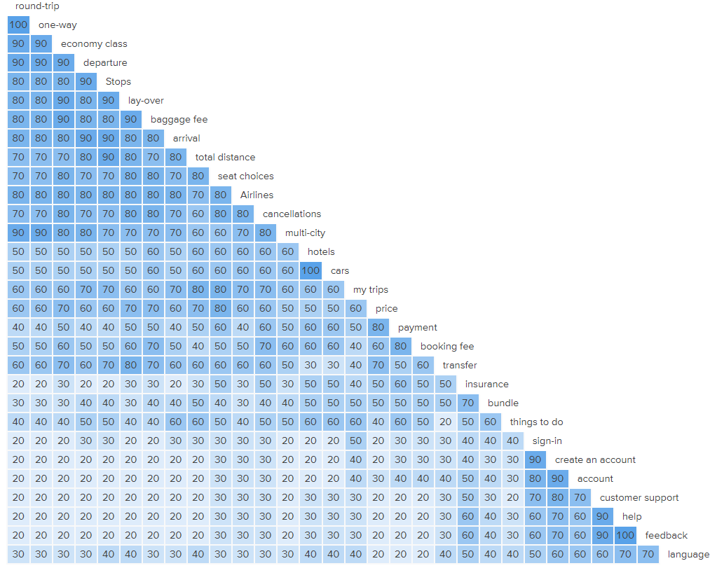
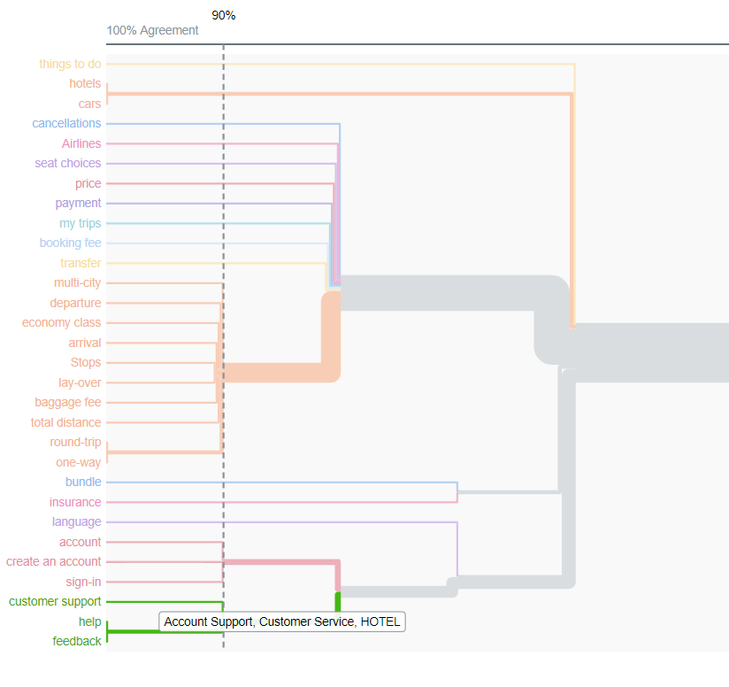
Similarity Matrix and Dendrogram Results:
Similarity Matrix and the dendrogram show that “customer support”, “help”, “feedback” should be grouped together as it is in Expedia.com. The “customer support” button is also loosely linked to the “account” button as 80% of the users agreed with the grouping. This is implemented by Expedia already as both “account” and “customer support” are situated on the top right-hand corner of their landing page. The similarity Matrix and the dendrogram show that the problem with users not being able to find help when they need it is more likely to be the problem of labeling.
Similarity Matrix of 30 different terms of Expedia.com’s landing page
Dendrogram of the 30 terms from Expedia.com’s landing page.
Standardized Category Grid:
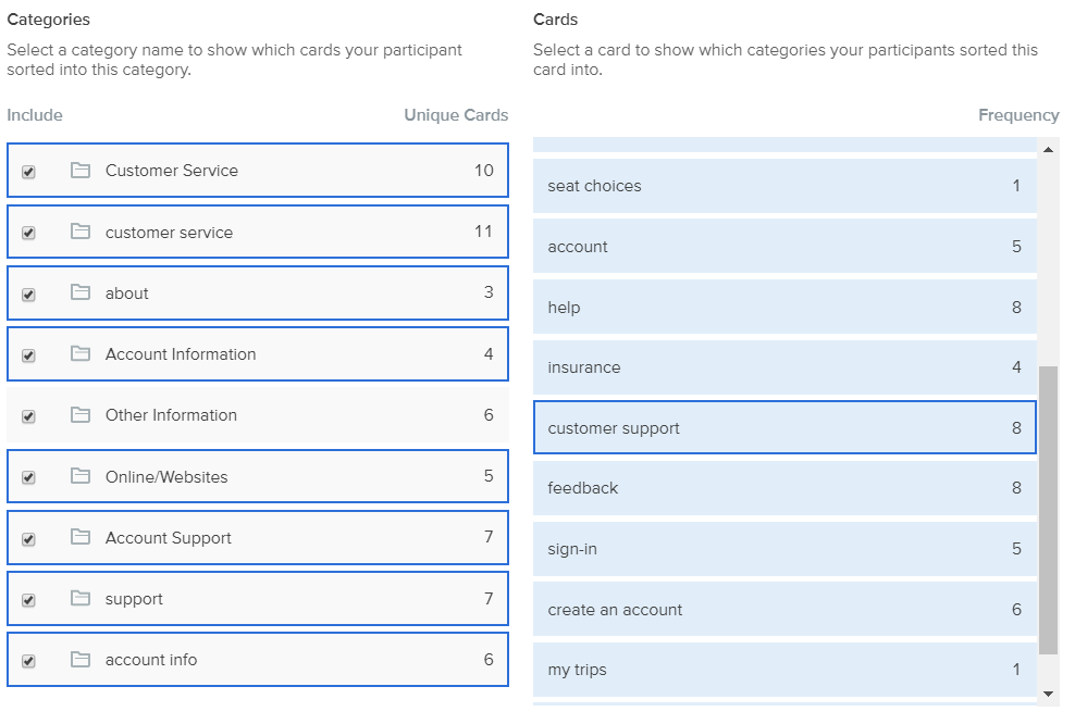
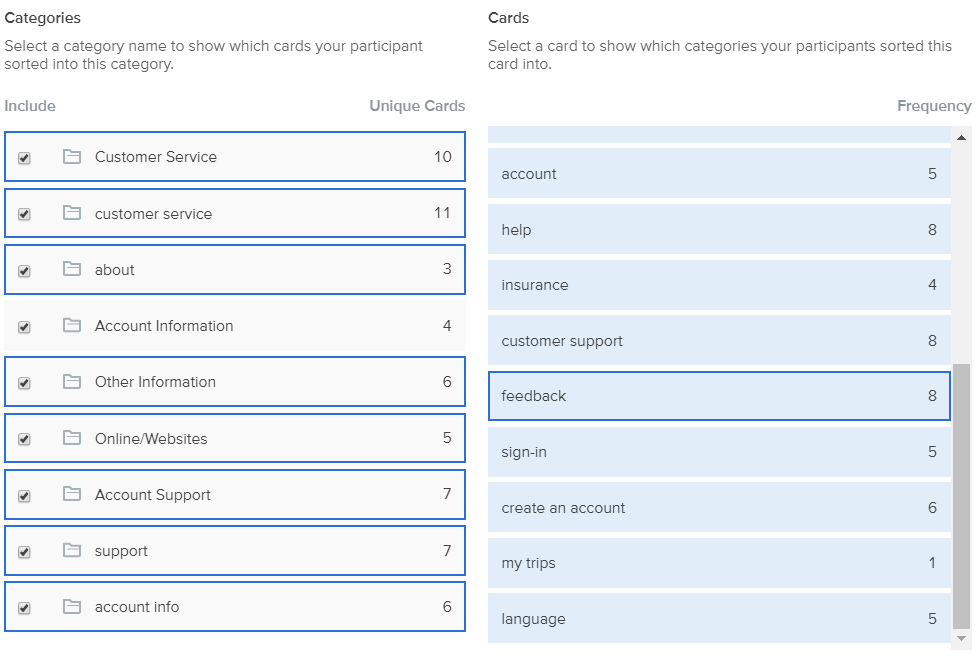
Standardize category grid shows that users grouped “customer support” and “feedback” into different categories which 6 categories are overlapping. This indicates that users have very different ideas on where they should be able to find “customer support” and “feedback.” There is no clear consensus amongst users.
This shows the categories the users think “customer support” should belong to.
This shows the categories the users think “feedback” should belong to.
Individual Option Summary Analysis Results:
Summary analysis shows that participants have very different interpretations of the option “customer support”. 9 out of 10 participants categorized it into different buckets.
Participants disagrees on the interpretations of the option “customer support”
Findings 3: Forcing users to choose hotels before flights during bundle search causes the users to abandon the bundle search.
Location: Bundle Search Results Page
Severity: 4
Detailed Descriptions: Users prefer to choose flights before choosing hotels. Four out of five users quit the process at this step to search for hotels somewhere else. One user said: "I want to know what time I am getting in first before I book any hotels. If I get in too early, I can't check into any hotels." Another user said: "There are a lot of hotel choices, there are not that many flight choices."
Recommendations:
Change the bundle search process to selecting flights first as this follows the users' natural though progressions. More quantitative research can be conducted using a survey to assess if a statistically significant portion of the population like to book flights before hotels. Additionally, constructing a user shopping journey map will also help Expedia to design the shopping process that is more natural for the users.
Impact of the Recommendation:
Participants expressed highly positive emotions when they were asked about their attitude if the flight and hotel booking switched orders during the post-task interviews. One participant remarked: “that is how I actually book most of my trips!”
Appendix
Limitations of this study:
Priming bias. The user might have already been exposed to similar interfaces by the third image. It is possible that the time spent on task is shorter for the later images due to this priming effect. The showing order was rearranged to reduce this risk.
Users may have learned how the “multi-city” option is categorized. Thus, whatever the task 2 or 3 is may be made easier due to this learning. This may contribute to task 2 and 3 being completed faster with less error.
The sample size for this research is 4 due to resource limitations. More samples are needed to have a decision-making result.
List of other 26 Issues Found During the Study


